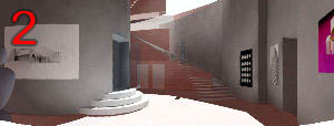
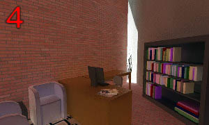
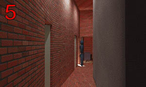
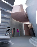
Peter Gruhn's B2-Studio Final Presentation
A theater and arts center in Chinatown, Boston.
Ideas
There are a few ideas which came together to inform my design for this project.
-
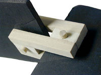
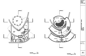
My 'tectonic object' from explorations earlier in the semester has been on my mind since then. Not as a specific item to incorporate, but as a source of themes. It is particularly attractive for the way it creates opposing embracing flows of form.
-
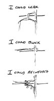
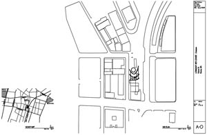
Site analysis revealed a strong flow of pedestrian traffic along Beach St., through the Chinese gate, across the street, and into the Leather District. After examining traffic options, I chose to allow that traffic to divert off its primary axis and through the site. To augment experience rather than compete.
-
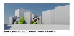
A dragon sculpture of my own was modeled into the site on a whim. It was immediately obvious that the dragon allowed traffic flow and hinted on the embracing flow of the tectonic object.
-

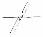
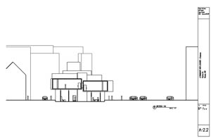
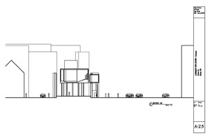
Site analysis revealed two contrasting axes. First, an east/west axis that has a consistent density along its length with a void at this site as the broad road and paved square open up the urban fabric. Second, a north/south axis with distant areas of taller high density urban experience bordered by large empty areas with the small island of more human scale density of Chinatown appearing in the middle of that void.
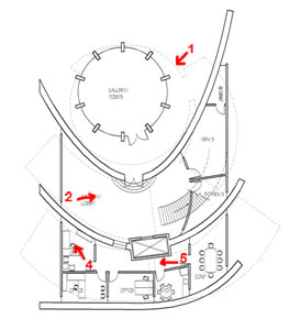
These two axes, very different, have important nodes at this site. It is as if you could swing a section plane through the city, hinged on this site and while the character of the section changes the importance of this site as a node is undiminished. This site is a hinge pin about which the urban experience moves.
The idea of hinging turned out to tie back nicely to my tectonic object.
-

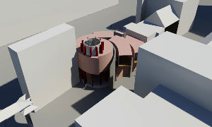
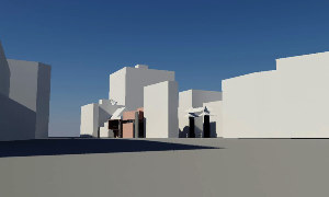
There is a view of this site from quite a distance to the north. The designer has a natural desire to address the distant viewer. Often this is done with some form designed to point at that person and thereby somehow draw the person in. I doubt the effectiveness of such a gesture: pointing away is not particularly inviting; a distant static gesture would get lost and ignored in the visual richness of the urban experience. Further, while the geometry of hinging may be implmented radially, the motion of hinging is circumferential.
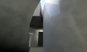
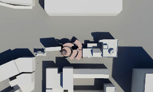
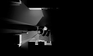
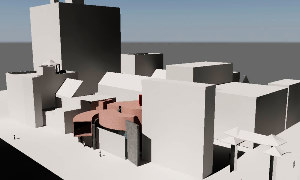
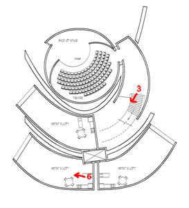
By providing large walls on site that are not parallel I afford the distant viewer views between some walls and occlusion of others. Parallax motion changes the view; revealing and concealing. This provokes interest and motion. The primary walls cause the distant observer to hinge about this site; to be aware of it. That awareness is what attracts them.
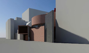
Closer to the site, moving along Hudson Street, the passerby feels the change in angle from wall to wall and sees their sweep across the site and becomes aware that the walls are moving around some central hinge even if the pedestrian is simply moving along the sidewalk in a line, their sense of the site is informed by these walls.
-
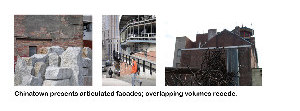
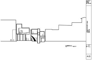
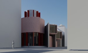
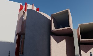
From the streets of Chinatown, views looking up from the street constantly reveal a highly articulated roofscape of overlapping forms and voids. This neighbourhood is not canyons of skyscraper boxes but rather stacks of rich texture. A nearby park has granite blocks that echo the theme. Even the parking garage across the expressway has a richly textured facade.
This experience informs the articulation and arrangement of form in this project. Where the strong gesture of the primary walls could call for a similarly monolithic completion, I opted instead for a more human scaled assembly of parts which are in motion about a central hinge pin while presenting the neighbourhood with an appropriately scaled and highly articulated grouping of form and void.
